When you’re inside a well-designed room, you know it. It all works. Every element at play is literally at play. Everything has a purpose and is working together to tip off the receptors in your brain that make you go:
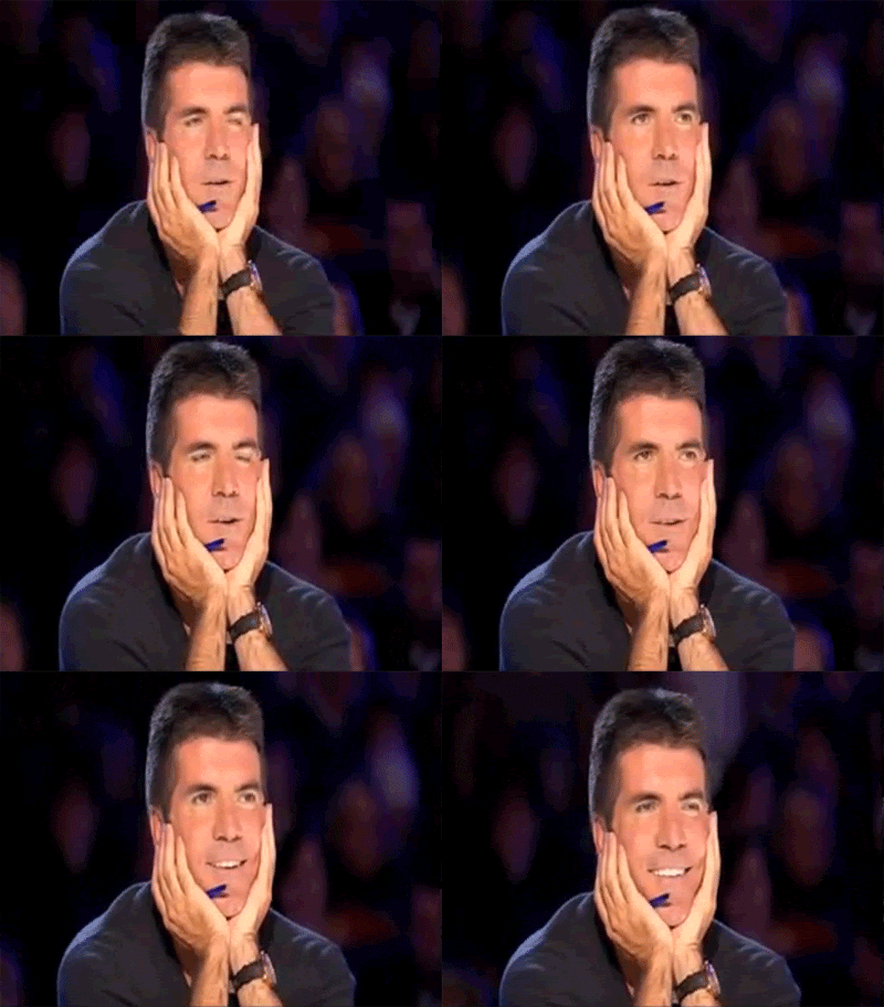
And when elements in a room are not cohesive, you know that too. The science of aesthetics is fragile, and one wrong step can flip your event from feeling like a mystical universe of endless possibilities to stepping inside your crazy aunt’s house where none of the decorations go together and there are just so many cats. Nothing makes sense there.
Planning an event is daunting as hell – we understand. And design is its own animal. It’s that extra oomph that ties the content and context together to make actual, Harry Potter-level magic.
Harry Potter didn’t walk into Hogwarts day 1, pick up a wand, poke Voldemort in the eye and call it a day! We had seven books worth of trial and error and horcruxes. Bottom line – you’ll have to do your homework if you want to be a design master.
Whether you have to tackle the design on your own, or you hire a team, it’s good to know the main pillars of aesthetic design. Without them, you’re basically at the swim meet with no arms or legs. It won’t go well.
Now, we’re not about to let you drown. Event design is a lot easier to wrap your brain around if you break it down into the fundamental elements:
Light
This element alone can define your mood. The difference between warm and cool lighting is enough to change the genre of a movie. Lighting design can be like that rabbit hole you fall into every time you search on YouTube. Four hours later and you’re perfecting acrylic strokes with Bob Ross. It’s a deep subject, so we’ll hit the basics.
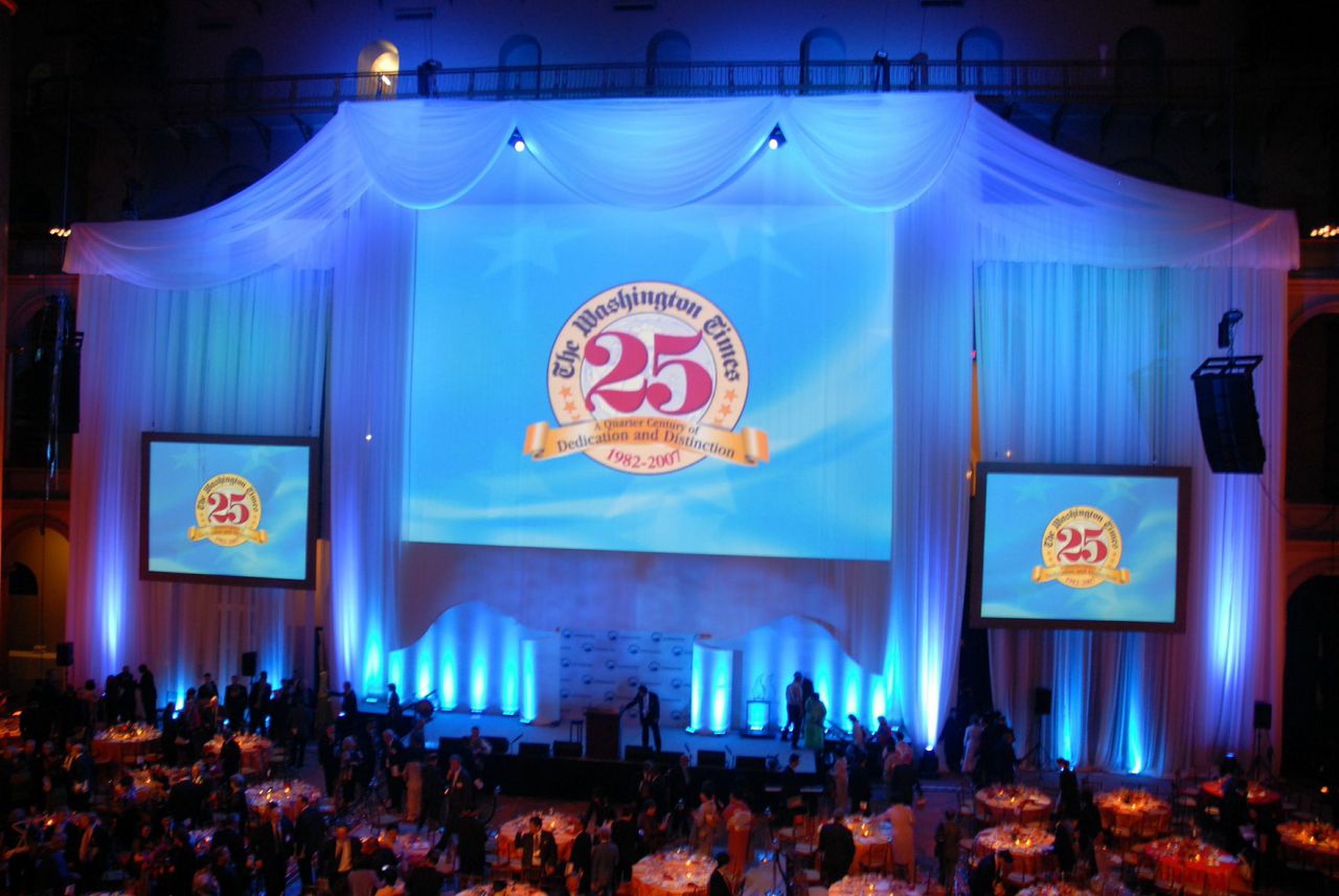
Use lighting to illustrate your atmosphere. What mood do you want to convey? Are you using natural lighting or creating a “special effects” informed atmosphere? You can be very basic with your lighting design, or it can literally transform the event space. Light can spill into almost all of the following categories. It can create color, shapes, emphasize texture, etc.
Color
Think of the color wheel as the psychological vein that marbles your venue space. Event designers will choose a palate that subtly evokes emotion to fit the intended theme. A lot of set designers start with all white props and then “wash” them in colors that match the mood. Washing white elements with colored lighting also allows you the flexibility to assign different color combinations to different portions of your show.
Shape
When you walk into a well-orchestrated space, your eye doesn’t automatically dissect the individual components of the room. You don’t step inside and think “Wow, just look at those vertical lines over there dissecting the visual weight of the big round tables!” An untrained eye sees the result of smart shape work – the work of art rather than the elements alone.
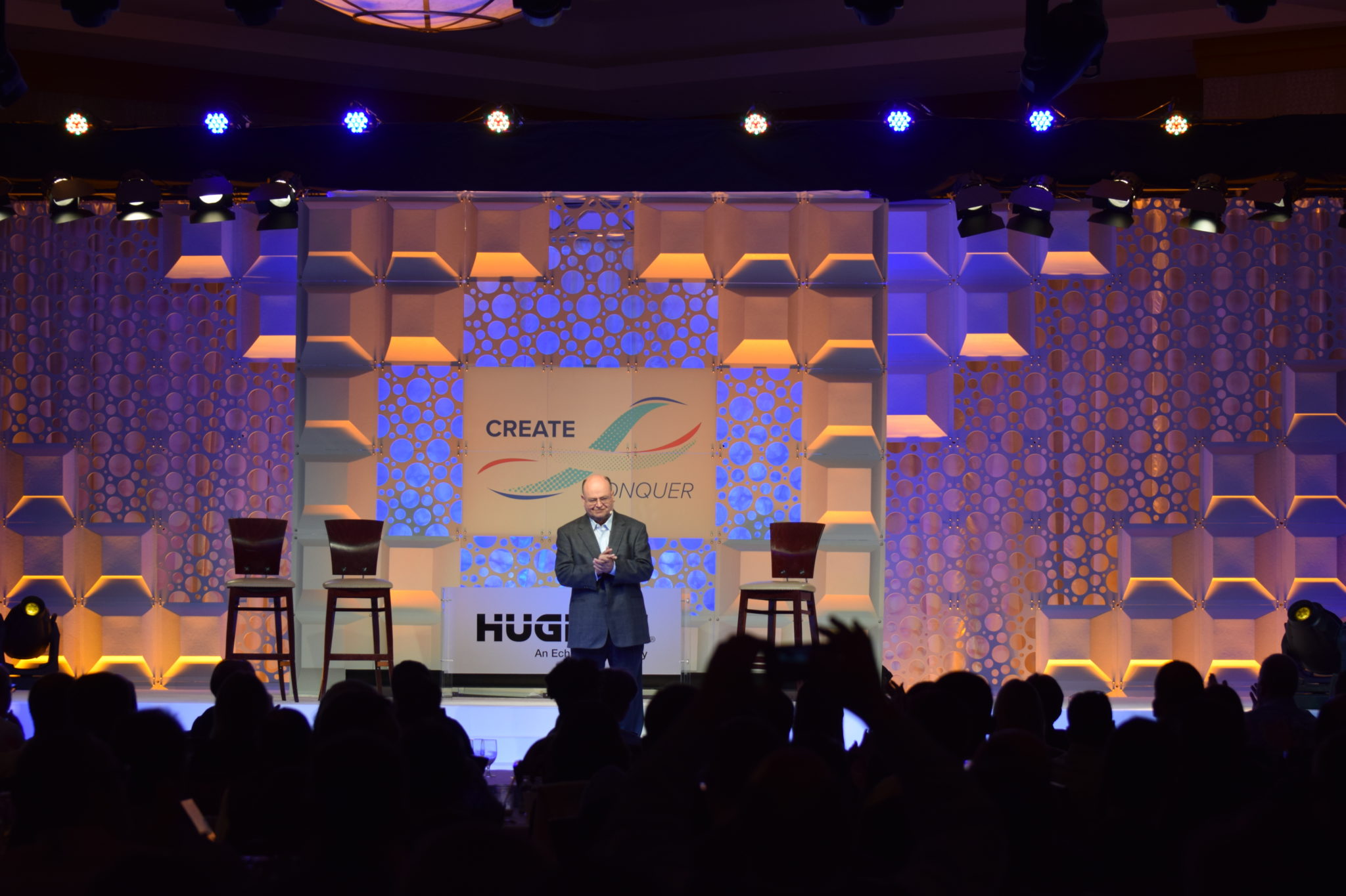
The designer, however, uses all different shapes to create movement or visual weight in the room. When it comes to shapes, you’re creating visual effects by manipulating the size, color, continuity, and variety of the forms.
3D
It’s anything that’s not flat. Duh.
Flat is boring and static. Adding an element of 3D gives your set or venue dimensionality and depth of field. The more objects you add on top of a flat background, the deeper and more dynamic your created world becomes.
Texture (visual)
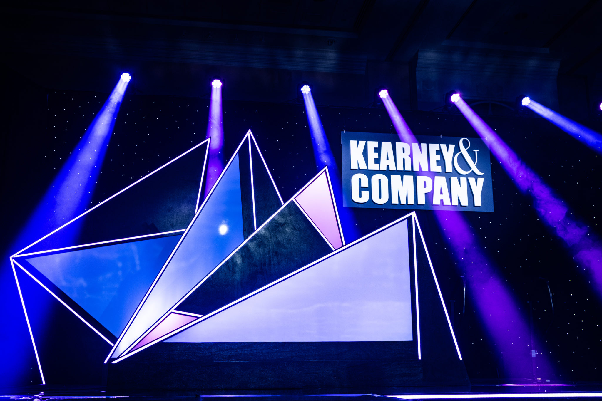
Using your elements to create visual texture is another effective way to make your atmosphere more exciting. Think about including sharp, clean-cut surfaces and mixing it up with soft, billowy drapery to give the audience some variety as their eyes move about the venue.
Texture (Physical)
Take advantage of an often neglected sense – touch. This can get as weird as a trampoline floor, or be as basic as a soft rug. When you invite your audience to touch, you’re opening another line of communication. This is an intimate opportunity for people to engage with your brand in a completely unique and specific way. And they’re more likely to remember it.
I went on a five-day family trip to Seattle when I was 14. We saw the space needle and rode big whale-watching barges, but the most explicit memory I encoded on that trip was pressing my hand against a big ice wall at a popup Titanic museum. Weird, but true. This was a brilliant call on the designer’s part. That ice wall brought a physical experience into a storytelling exhibit which imparted on me, a visceral memory. Lost a pair of shoes this weekend, but I’ll never forget putting my hand on the iceberg that sank the Titanic.
Space
Empty space. It’s so simple….
Gives your eyes a break and directs attention to where you really want it.
Alone, these elements are a lot less intimidating. The trick is the use of the elements. It’s putting them to work – executing the aesthetics in a way that creates a one-of-a-kind experience. We do this by incorporating principles of art and design, and applying them to the elements so they come together to form a mood. Here are some of the big ones that make a serious impact on overall design:
Balance/Proportion
Use different sizes of your shapes and empty spaces to create balance or skew normal proportions. A large object offsets and balances a series of smaller shapes. Your key should be to distribute elements in an aesthetically pleasing way. For example, break up long lines with softer shapes, or jazz up a plain flat surface with some live greenery… 3-D element: check, pop of color: check!
Emphasis
Use the elements to visually direct attendees. You could try utilizing empty space to guide your audiences’ attention to parts of the design you want to show off. Introduce a color outside your scheme for the rest of the venue if you really want to draw attention. You want the focal point to stand out like the ugly duckling – but after it turns into a swan. Give it something the rest of the design elements don’t have. If you’ve got all rounded shapes, give your duckling sharp edges.
Repetition
This is a big one when it comes to creating a sense of harmony and unity throughout the venue. Repeat shapes and key colors so your elements read like members of one family.
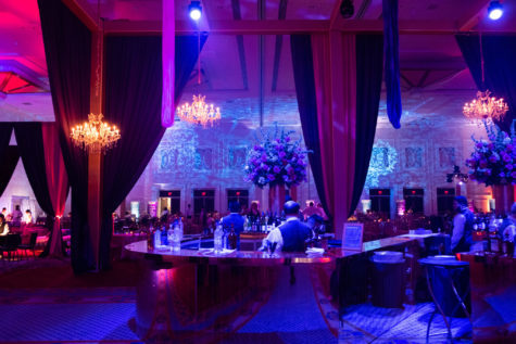
The cool thing about design is that you can be creative in your execution of the elements. Try different things and create something completely different! The possibilities are endless – as long as you don’t take inspiration from the crazy aunt with the cats.
Watch every element come to life when you plan your event with TalkingTree!
Tell us a little more about your upcoming event and our production experts can help you transform it into a fully engaging, memorable experience.
